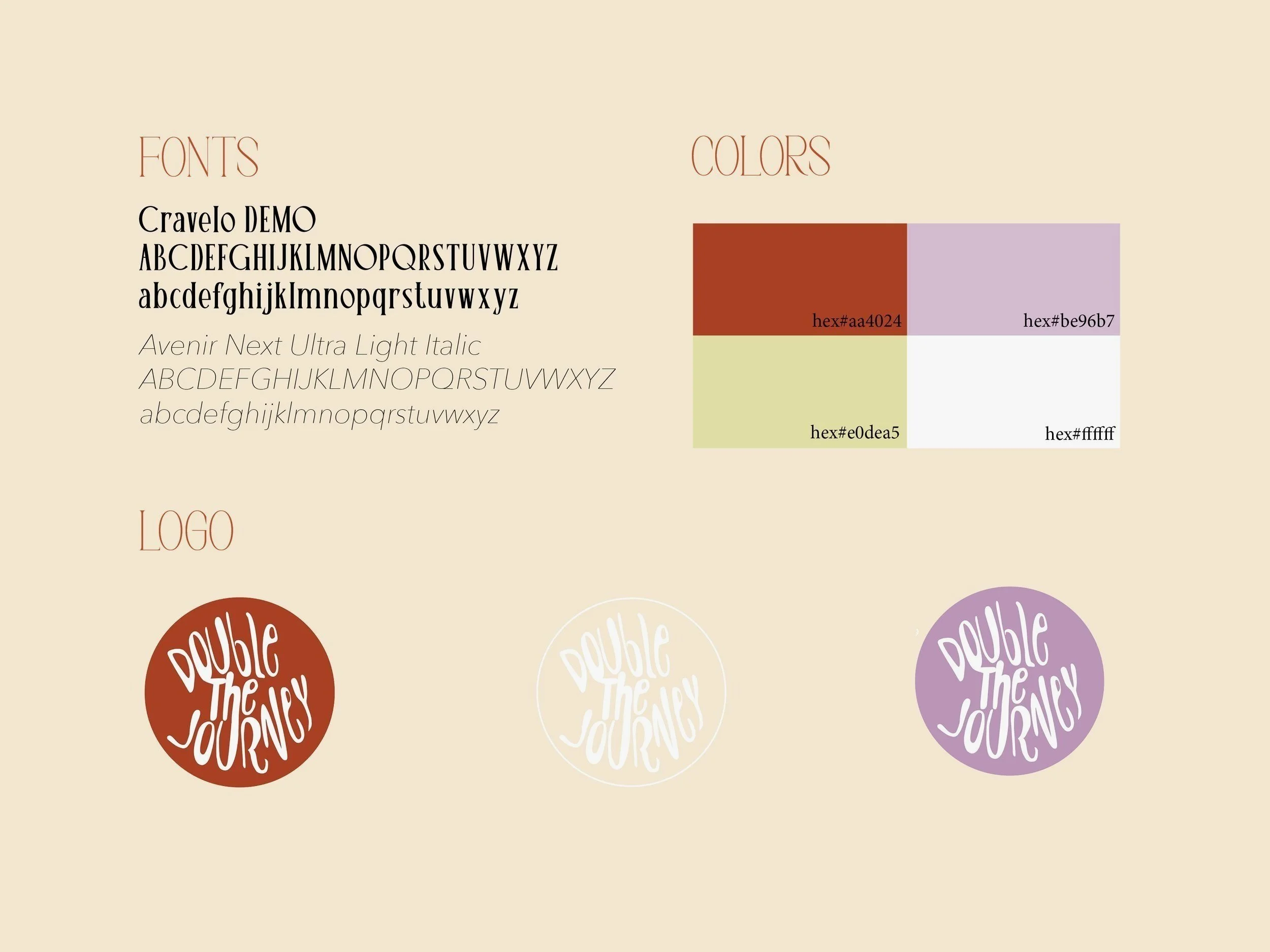
This identity system was created to establish the core visual direction for Double the Journey, ensuring a cohesive and recognizable brand across all platforms. The goal was to craft a look and feel that balanced vintage charm with modern simplicity — a reflection of the brand’s nostalgic but fresh aesthetic.
The process began with selecting a color palette that felt warm, timeless, and on-brand. From there, a display font and a complementary body font were chosen to maintain visual consistency across designs. The logo went through several rounds of refinement before landing on a final version, with variations offered in the brand color palette to give flexibility across formats.
To bring the system to life, the final branding was applied to a full billboard mockup, showcasing how the colors, typography, and logo come together in a real-world setting. The result is a clear, memorable brand identity that sets the tone for everything Double the Journey puts out.